The Rivian mobile app is not only for unlocking doors, but the key to finding an adventure.
- Role: Visual Design Lead
- Agency: Internal
- Time Period: January 2021 - December 2021
Rivian brought me on in early 2021 to help them establlish the visual look and feel for the first generation of their drivers app. The brief being that it should do more than be a simple control for a users car, but that it should also inspire them to want to get out and explore.
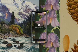
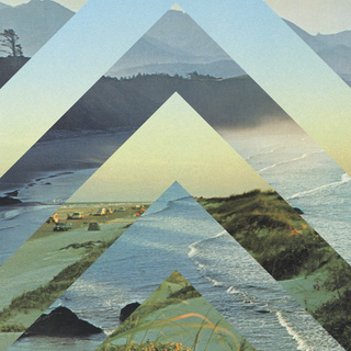
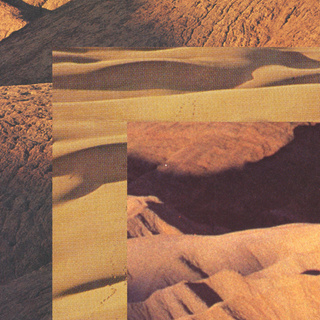
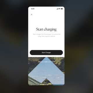
We created a series of collage pieces of nature photography that could be used in inspirational but also functional ways.
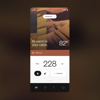
Cool vs warm environments were used to represent temperature, motion within the shapes helped to represent driving and charging, and energetic imagery was used to the celebratory and get up and go moments.
Pairing this with a design and illustration system that made this app more like the control for an $80,000 toy rather than just a car, we brought in that sense of adventure and fun that the brand is known to represent.


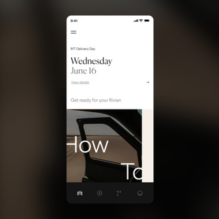
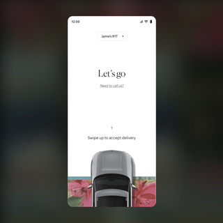
Being a new company, and deliveries were taking time, a large part of this app was the pre-order journey. We didn’t want customers to feel forgotten about, so we created an experience for them to help educate and build excitement for the delivery of their vehicle.
This included articles on how to use and maintain the vehicle , information on their delivery status, all the way up to the moment they get to accpet their vehicle.
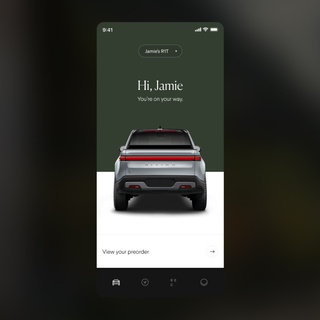
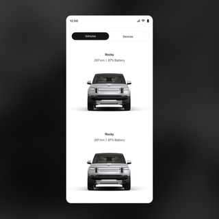
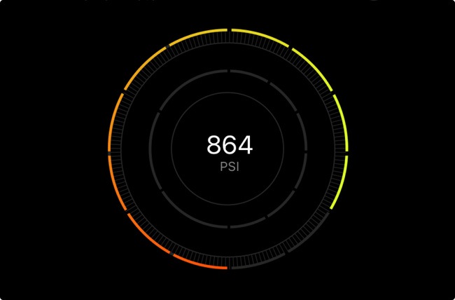
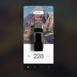
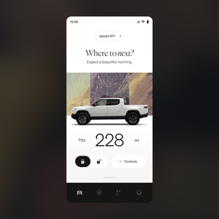
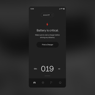
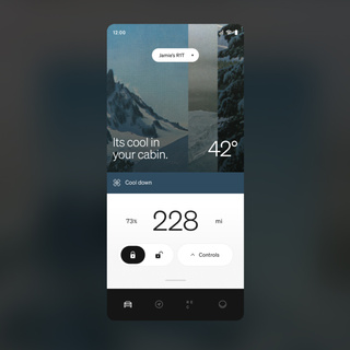
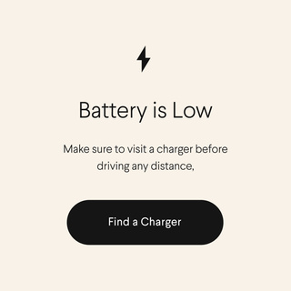
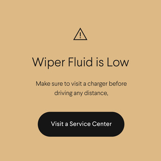
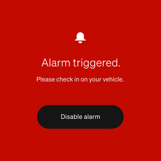
Once a user has received their car, their home screen then will always reflect the status of their vehicle. If everything is good to go, then it’ pushes them to get up and go. If it is currently being driven or in a state such as charging, that is reflected. Major faults are shown in full screen takeovers, where minor inconveniences are given a half screen tile.

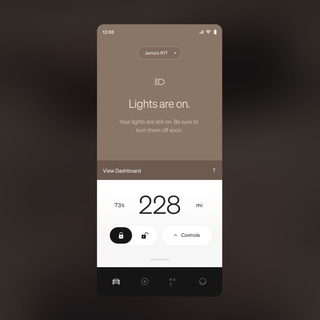
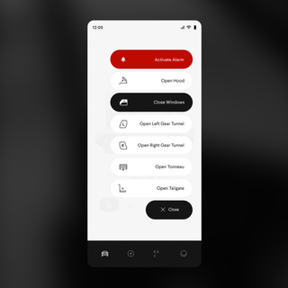
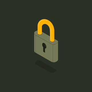
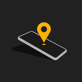
For moments that were more utilitarian or an alert, we brought in an illustration and icon style that maintained a sense of personality while keeping a serious tone.
However, anything critical was blasted with red and made to be as unsettling and brutalist as possible.
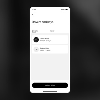
Users also had to be able to do some of the more mundance tasks, such as managing their drivers and keys, without much interference or confusion. So a more bare bones look and feel was applied to the under the hood of the app.