Helping a weather company, based in science and math find its digital design language.
- Role: Visual Design Lead
- Agency: Huge
- Time Period: Fall 2019
AccuWeather is a company rooted in cutting edge science and technology. However their digital presence for business and enterprise did not reflect that. Their digital branding and design was extremely dated and their web presence was barely optimized for mobile. They needed a complete revamp from site structure through visual design.
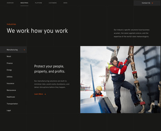
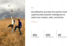
Taking inspiration from Swiss and Functionalist design, we proposed a creating a structured system based in math. Using a heavy grid, bold type, and clean images with crisp color blocks we could achieve a high level of design that also contains that scientific/future forward look and feel we wanted to bring in. Also, the heavy mathematical system will make building everything out responsively much easier (we ended up creating everything based on a system of 4 - a nod to the seasons).
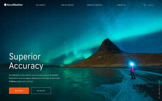
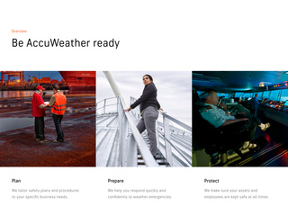
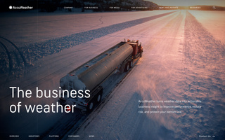
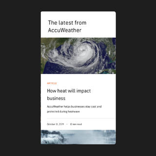
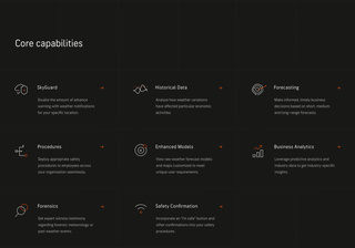
We created a double grid system – a 6 column exposed grid that sat over a 24 column invisible grid (which broke down to a 1 over 4 for mobile). The exposed grid gave a sense of technicality but the use of the invisible grid below allowed us to break the exposed grid for impact moments like titles, pull quotes, and stats. We did keep all images locked into the exposed system which made animations and transitions much smoother.
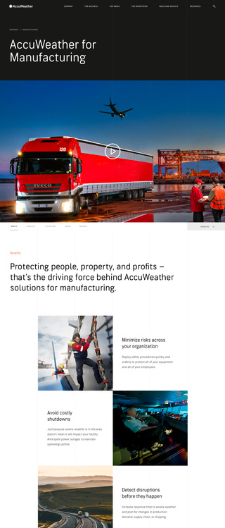

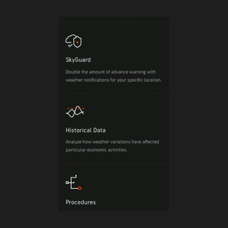

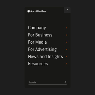
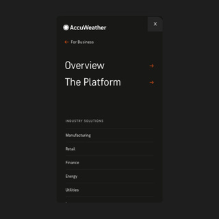
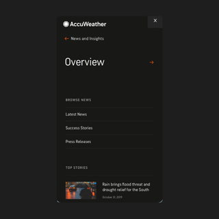
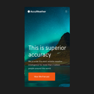
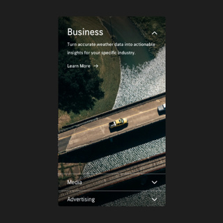
Since the top grid shrinks down to one column on mobile, more horizontal guides are brought in to replicate the look and feel of desktop. Along with that the use of a subnav that locks to the top on the subpages makes the longer mobile pages easier to navigate and jump from section to section.
The use of full bleed images makes the mobile experience even more immersive. Plus when combined with use of white space around more content dense sections, it makes the site much more clean and digestible for the user.
