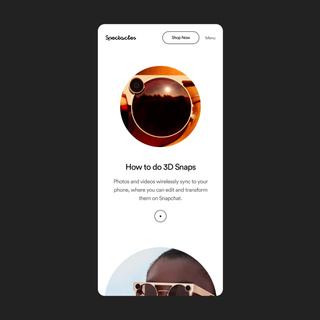
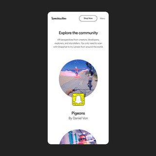
Taking Snapchat to an virtual and surreal dreamscape through the Spectacles 3.
- Role: Visual Design Lead
- Agency: Gretel
- Time Period: Summer 2019
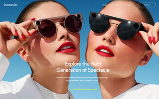
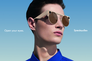
In late 2019 Snapchat launched the Spectacles 3. The third version of their signature AR glasses was meant to be something more than just a fun gimmick, but also a fashion statement. With the new stylish design, they are meant to blend the worlds of fashion and technology (along with being meant for an older audience).
In order to sell these new glasses, they needed a site that let the user experience the Spectacles world and also show that it was no longer just childish filters, but like living in a Prada or Kenzo ad.
Working with the agency Gretel, I helped with the UX and design for the site. We spent a lot of time diving into the app and Snapchat world as whole to fully understand their capabilities. We then were able to create an experience that went to this new world but maintained their Snapchat brand roots.
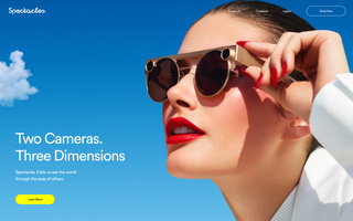
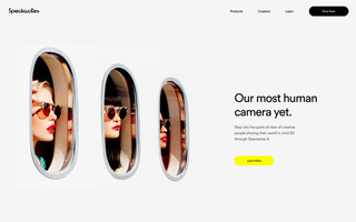
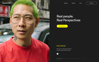
Since the idea of Snapchat filters is based in surrealism and the client wanted to pursue an idea of high fashion, I found a lot of inspiration within fragrance ads, old editions of magazines like Harpers Bazaar, and artists like Salvador Dali and René Magritte. I found a lot of imagery that involved layering and mixing real world photography with dream like imagery which was very indicative of the Snapchat brand and would work well to help bring this new product to life.
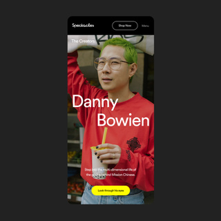
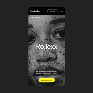
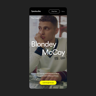
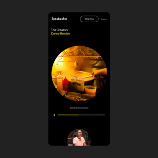
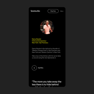
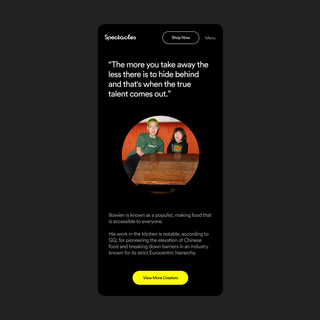
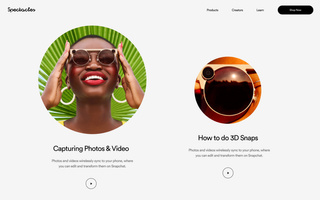
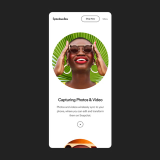
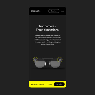
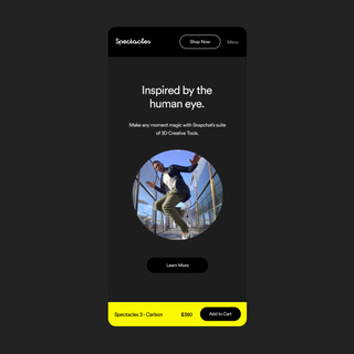
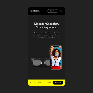
Using full bleed imagery was key to immersing the user into this new Spectacles world along with allowing the user to be able to continuously scroll through new content. This combined with a simplified/lack of navigation made it feel more like an app experience as opposed to a website.
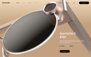
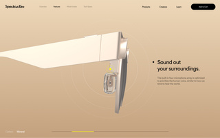
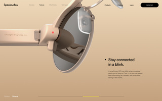
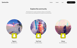
Since educating new and potential users about how to use the new Spectacles, and editorial section dedicated to learning was included. This was different how-to-videos tiled across the page leading into content created by the existing community.
