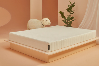
Earthfoam is the sustainable sleep brand that raises the standards of quality, comfort, durability, and transparency within a misunderstood category.

- Role: Creative Director
- Agency: Internal
- Time Period: November 2021 - Current
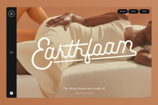
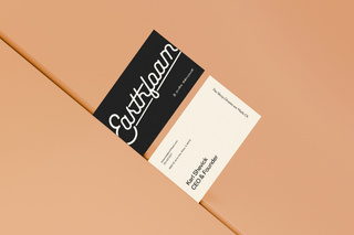
Earthfoam’s visual identity was originally inspired by retro Airfoam ads (the original foam rubber mattress) from the 1950s, which featured bright colors, space-age curves, bold lettering, and an old school script logo.
We wanted to give a nod to that time, when foam rubber was seen as this luxe natural material, but in a design system that was much more modern and reflective of what our brand stands for.
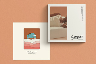
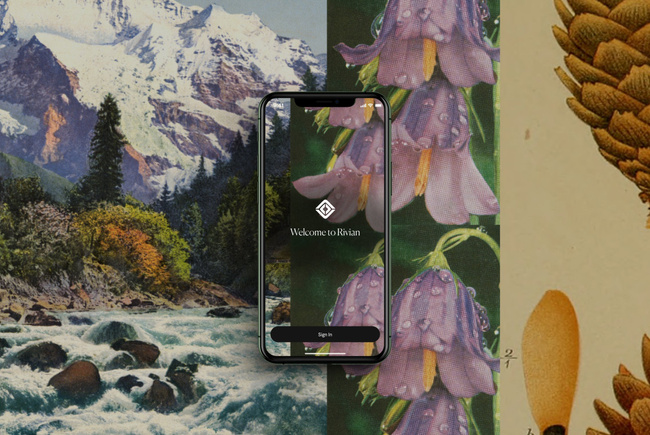
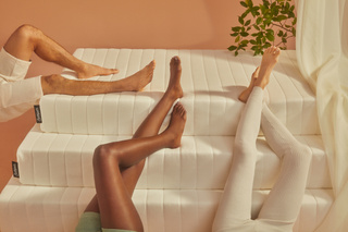
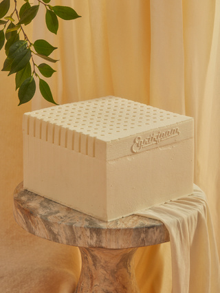
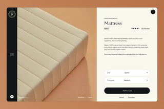
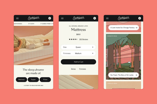
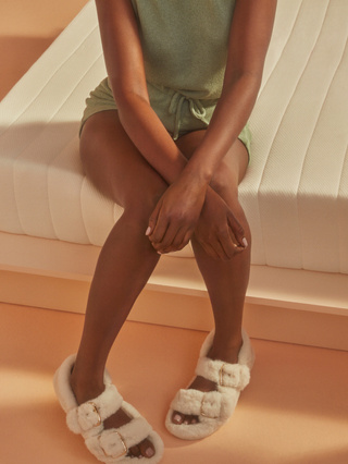
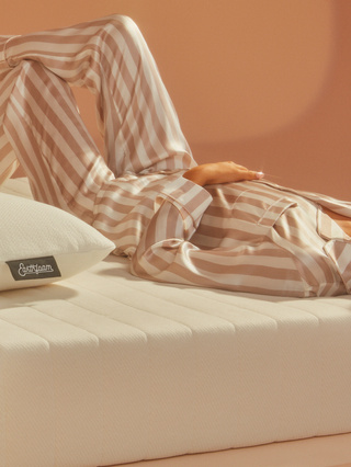
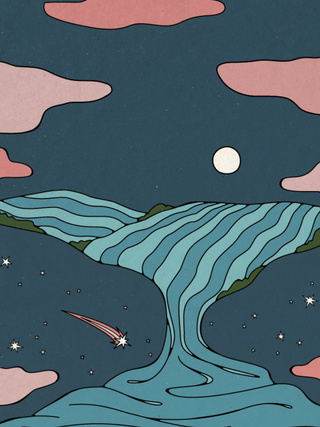
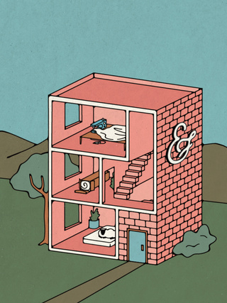
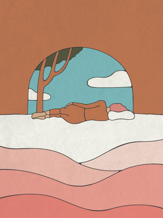
Combining elements of Japanese minimalism with photography and illustration styles that border on surreal, we created a dream world that lives within simple and clean compositions. Each one is meant to evoke that wonderous moment when you find yourself falling asleep.
When we mixed the script logo and bits of Sinhala within this system, everything worked together in this almost illogical way, much like the way dreams make perfect sense while you’re in them.
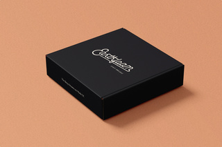
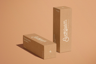
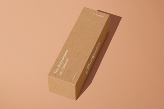
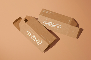
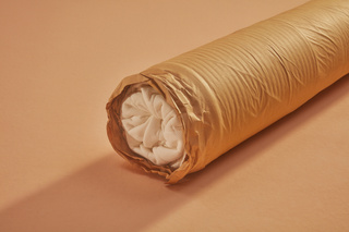
Not only are our products fully sustainable, but so is almost all of the packaging that they are delivered with (we’re still trying to figure out how to wrap our toppers in paper).
From the cardboard boxes to the paper wrapping we have aimed to apply our principles to everything we do.
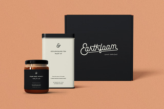
Within the fields where our latex grows, the farmers also cultivate ceylon tea and pure bee honey. In order to further support them, we created these wake up kits which will come with each of our mattresses.
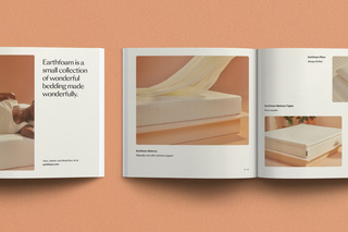
They include a tin of 25 tea bags and two jars of the pure bee honey as well as a magazine telling the Earthfoam story.
